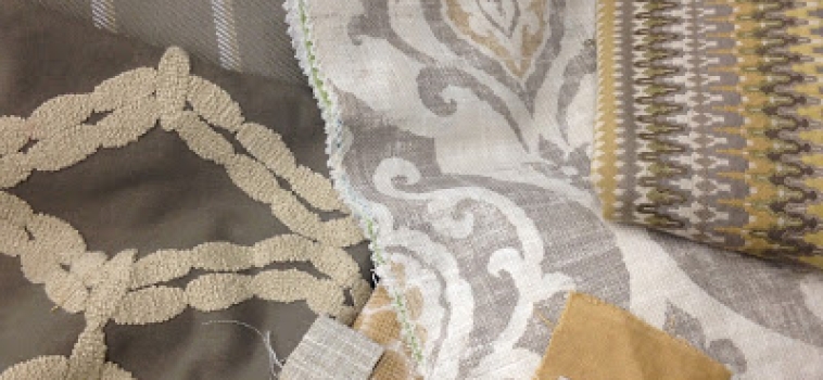
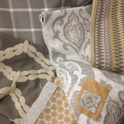
Neutral spaces can actually be quite colorful. The depth and range of undertones present in what would usually be classified as “neutral” (i.e. browns, greys, beige/ivory/white, black, navy, etc.) can make for a dynamic and detailed room design when pushed to the limits of the amount of saturation, contrast, and base tone present. The most interesting and well designed “neutral” spaces should focus on adding in distinctive details in a limited range and pallet through layering textures, patterns, and tones like this custom designed space below. The warm tans take on a gold hue offering warmth and vibrancy and the spectrum of grey and taupe provides contrast and depth anchoring the ivory details here. All of the patterns mix wonderfully together due to a combination of various scales, textures, and tonal coloration:
Related Posts


