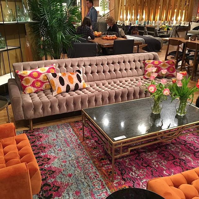
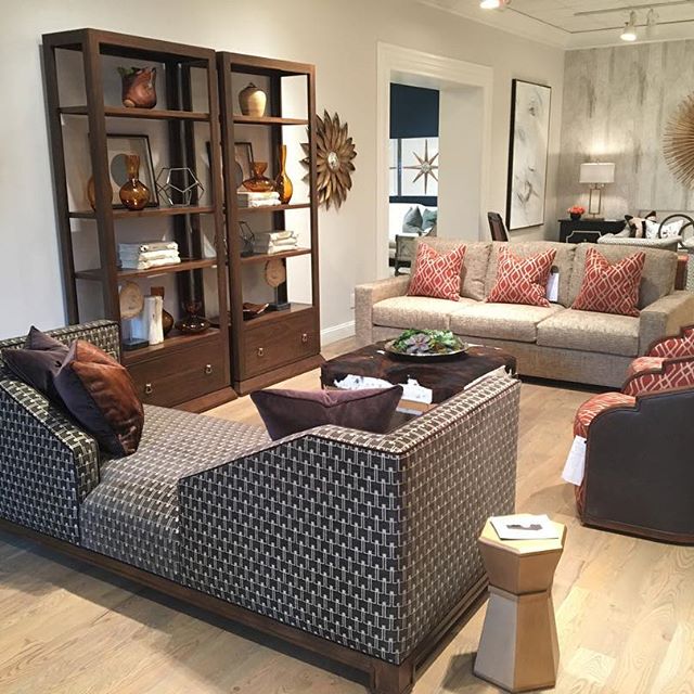
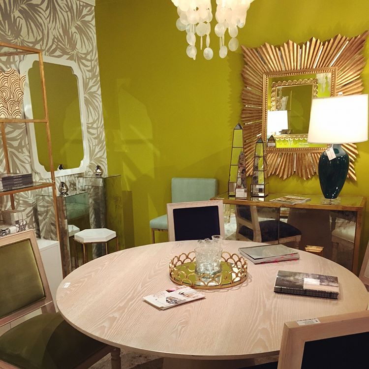
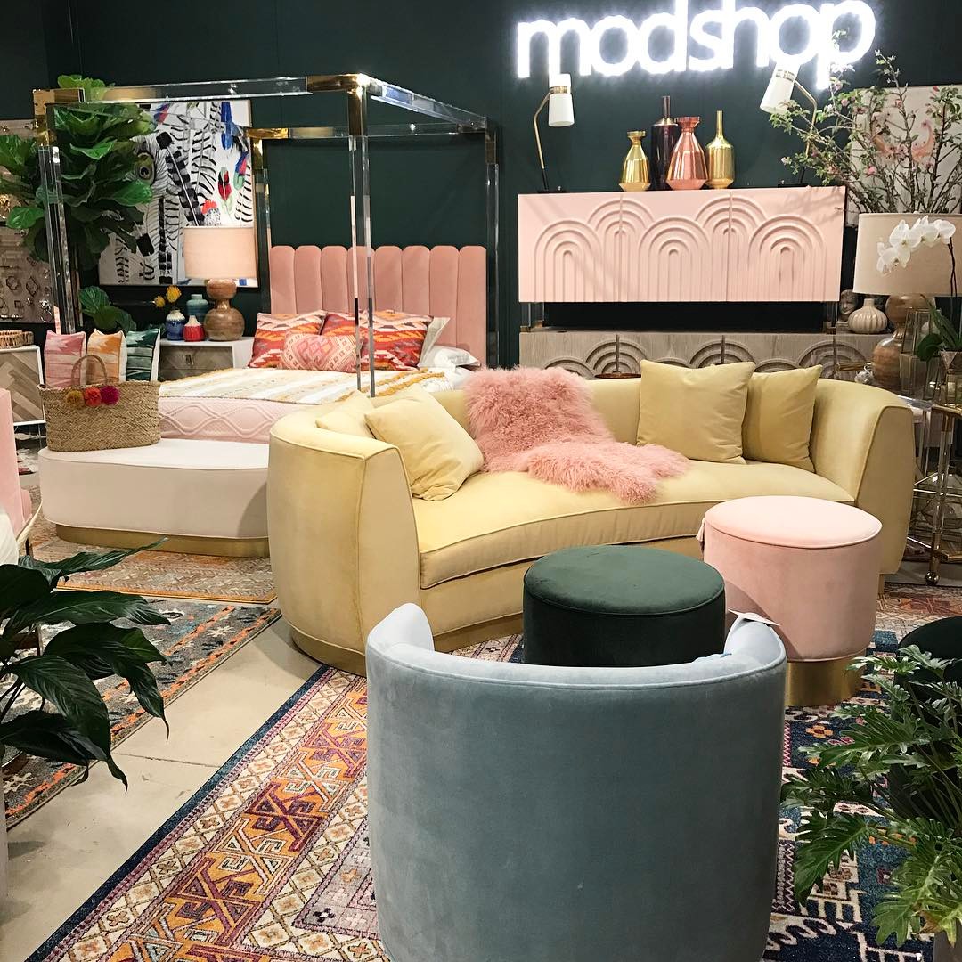
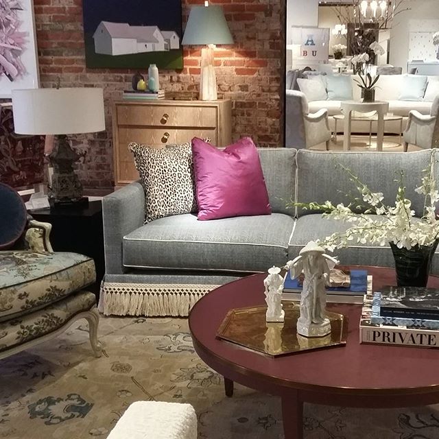
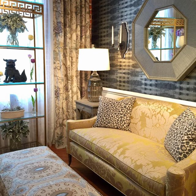
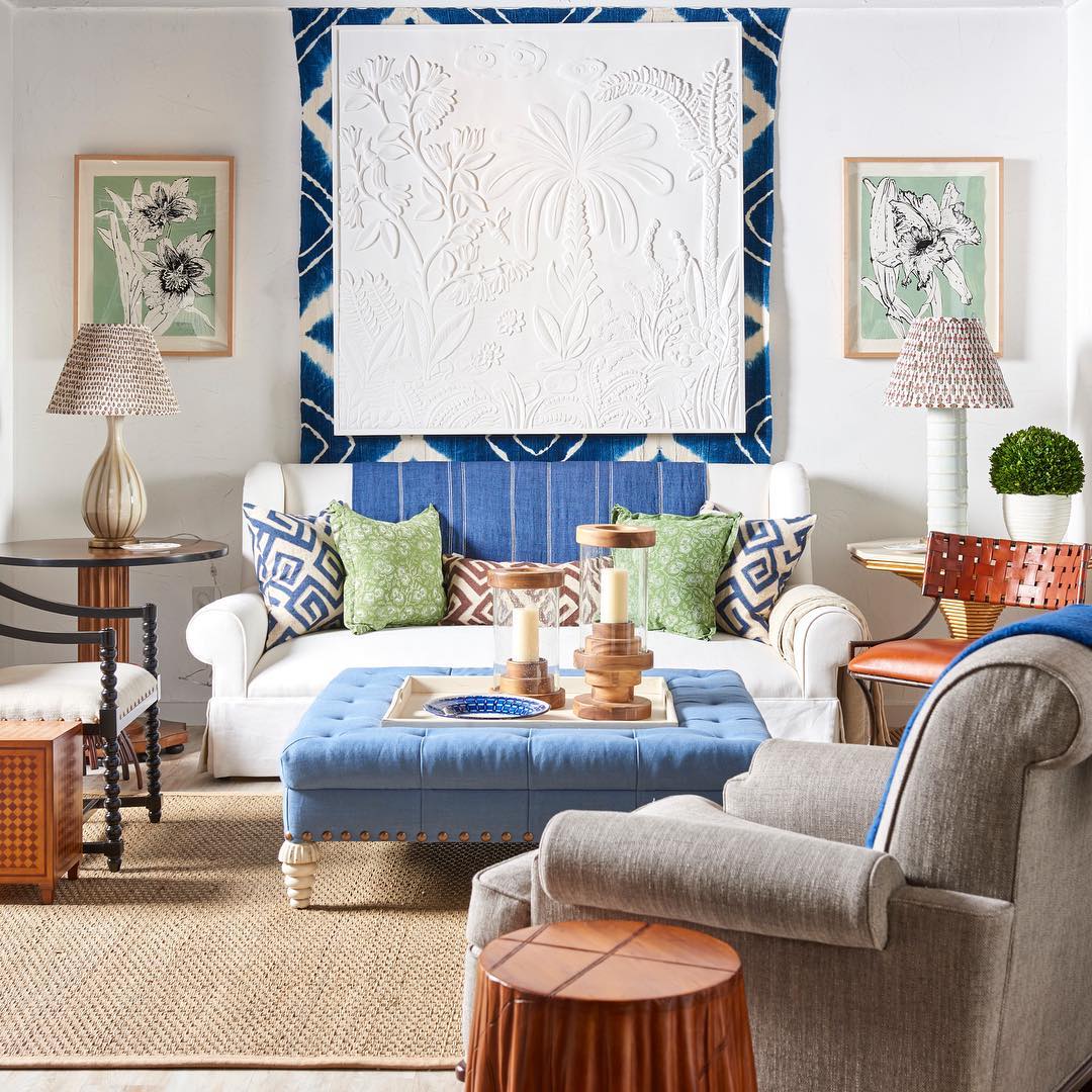
Midcentury Modern– With clean, sleek, and low profile lines of furniture silhouettes and case goods, references to starburst motifs in mirrors and hardware choices, lots of gold and brass detailing, pops of orange and mustard yellow, channel tufting, geometric patterns, and burled wood or tiger wood market this Spring evoked some groovy vibes and a certain Midcentury influence that was a dominant theme throughout multiple showrooms and vendors.
Wesley Hall via
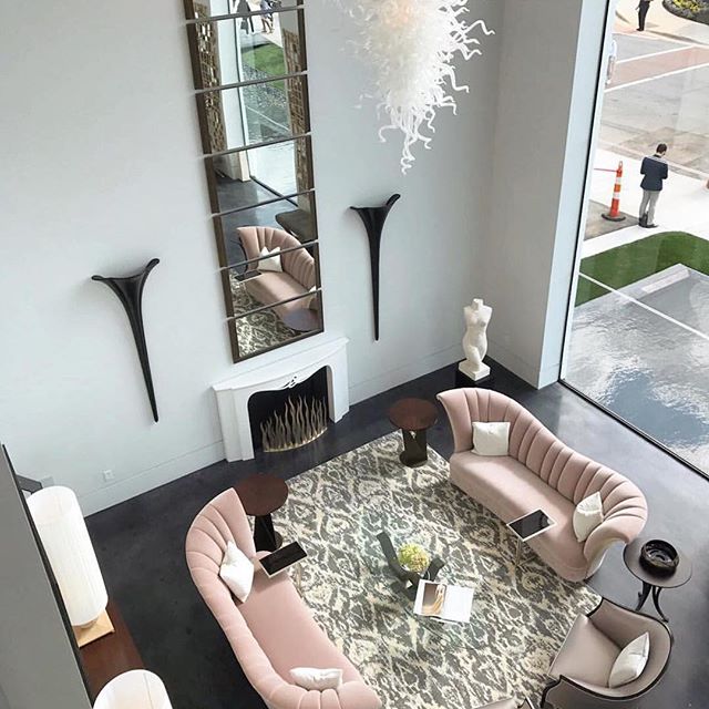
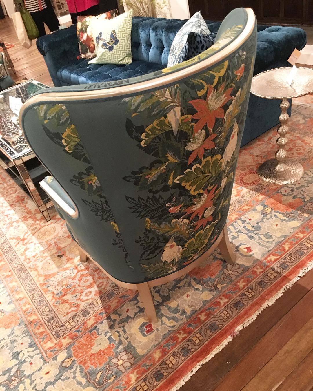
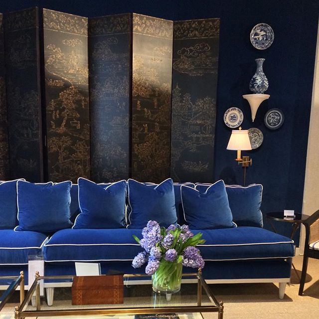
Art Deco/ Regency– Furniture lines emphasized the “S” curves famed for this era with feminine aesthetic notes juxtaposed with strong contrast and dramatic architectural pairings. Birds, florals, and chinoiserie motifs and bold geometrics emphasized this influence immensely. Some showrooms married this with the Midcentry nods for a distinctly Palm Beach retro feel while others utilized layers of luxe textiles and gilded finishes for a Regency take.
Christopher Guy via
Currey and Co.

Wesley Hall

Wesley Hall
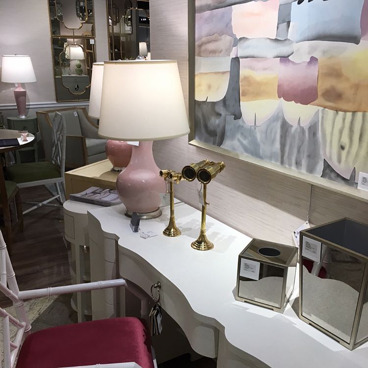
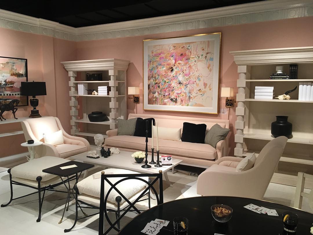
Blush– the blush trend is still going strong almost serving as a neutral of sorts in its own right when combined with other soft greys, ivories, taupes and sophisticated pastels- This hue came out a lot in union with a Deco influence as seen above with high contrast black. The emphasis on the blush trend here is to translate it a way that feels chic with complex pairings in order to avoid feeling too juvenile.
Mary McDonald via

Wesley Hall

Wesley Hall
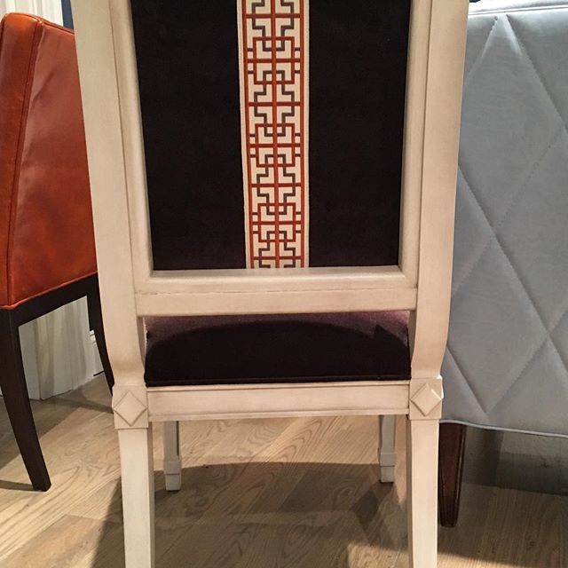
Skirted details/ Trim details – The unique application of bullion, fringe, and tape trims were all in heavy use on the hems of upholstered skirts as well as cushions and backs of sofas and chairs alike. Tailored table skirts are on the rise in popularity yet again this time with a sleek and sophisticated use of box pleated or paneled detailing with, of course, trim lining the hem and occasionally side of paneling as well.
Highland House via
Wesley Hall via

Wesley Hall
Mark D Sikes for Henredon via
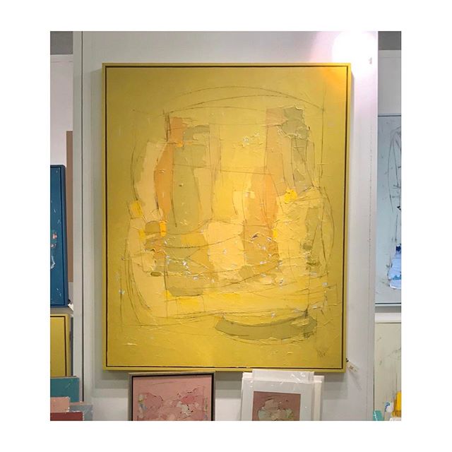
Primrose Yellow- foretasted to be one of Pantone’s decided color trends for Spring and Summer 2017 this sunny hue showed up as an accent again and again in larger, bolder, sunny pops to more muted and subdued buttery accents occasionally venturing towards that Mid century mustard family.
Alexis Walter Art via
Anna French/ Thibaut via

Wesley Hall
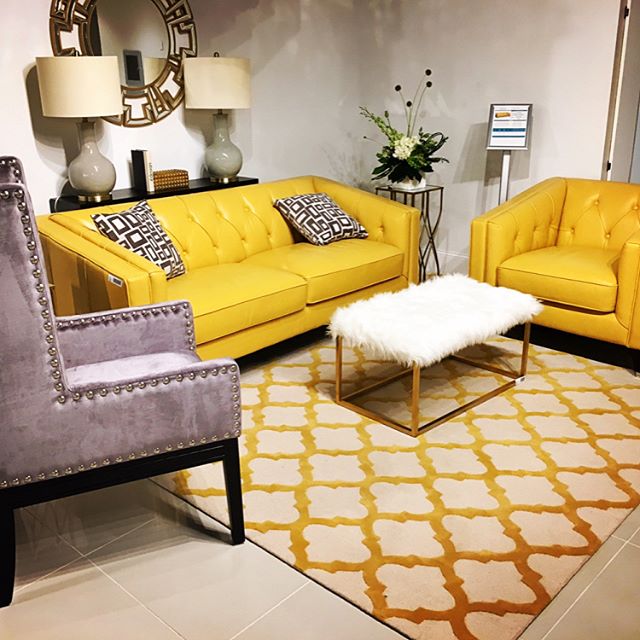
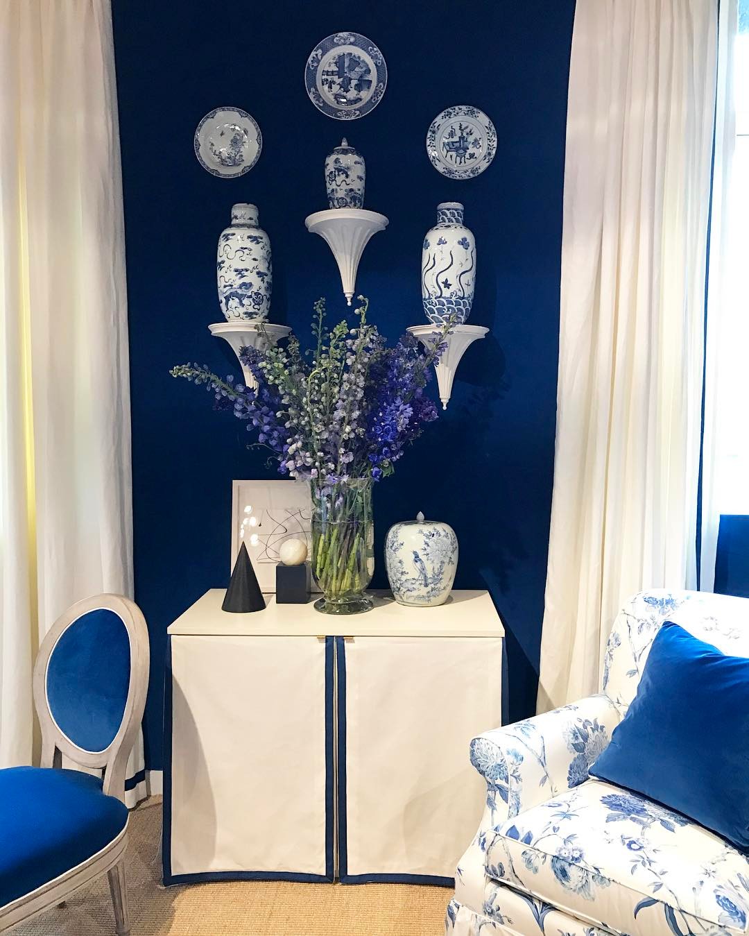
Niagra and Lapiz- Classic and notoriously traditional blue and white got a bit more playful and whimsical with more saturated lapiz and cornflower blue base notes. Blue and white pottery still served as an accent throughout some showrooms and navy is definitely still holding strong as a “neutral.” But this fresh take on this classic is now being mixed with more contemporary artwork and accents, more pattern layering, and more saturation and contrast for a fresh new feel.
Mark D Sikes
Bunny Williams via

Wesley Hall

Wesley Hall
