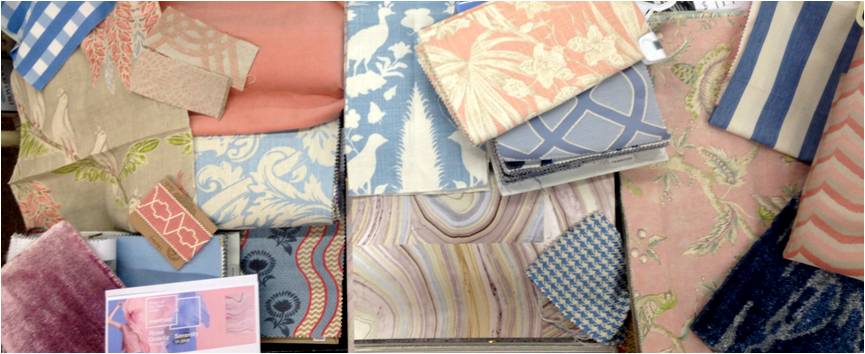
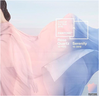
Well it is that time of year again, not only is the holiday season in full swing but it is time for Pantone to name and brand their famed “color of the year” and for this upcoming 2016 calendar they have selected a soft pastel duo rather than just one hue, a first for the famed Pantone name, of “Rose Quartz” and “Serenity”, a soft blush pink and periwinkle blue. According to the website, “Rose Quartz is a persuasive yet gentle tone that conveys compassion and a sense of composure. Serenity is weightless and airy, like the expanse of the blue sky above us, bringing feelings of respite and relaxation even in turbulent times.” With last year’s color being Marsala, a deep blend of rust and wine and years previous being shades such as Radiant Orchid, Emerald, Tangerine Tango, etc. the shift from brightly saturated hues to deeply jeweled tones to now, the softest whisper of a pastel is quite a shift- what are your thoughts on the new color trend? Will you be integrating these shades or variances of into your decor? Take a look at some of our special order designer rugs, trims, fabrics, and wallpapers below that we feel best represent this new dynamic duo below and stop by the store and let one of our designers help you begin to integrate this trend into your home:
{Source}